Procter & Gamble Crest Whitestrips package redesign
Background
Crest Whitestrips has been a top seller in the teeth whitening category for many years. As with most market leaders, success has lead to increased competition, particularly from private label “copycat” brands. Despite being a superior product, Whitestrips had become genericized, no longer viewed as the premium brand in the category.
Solution
The revised Whitestrips design incorporates the newly developed Crest beauty pillar design theme as its foundation. The clamshell structures were replaced with simple boxes that matched the “Classic” design and created a larger canvas for communication. Dark, pearl essent blues and clean, elegant typography help convey the premium positioning. Finally, the arc, which echoes the new Crest brand language, reinforces the concept of light and brightness.
Agency: Landor Associates Additional Design Credit: Joe Napier
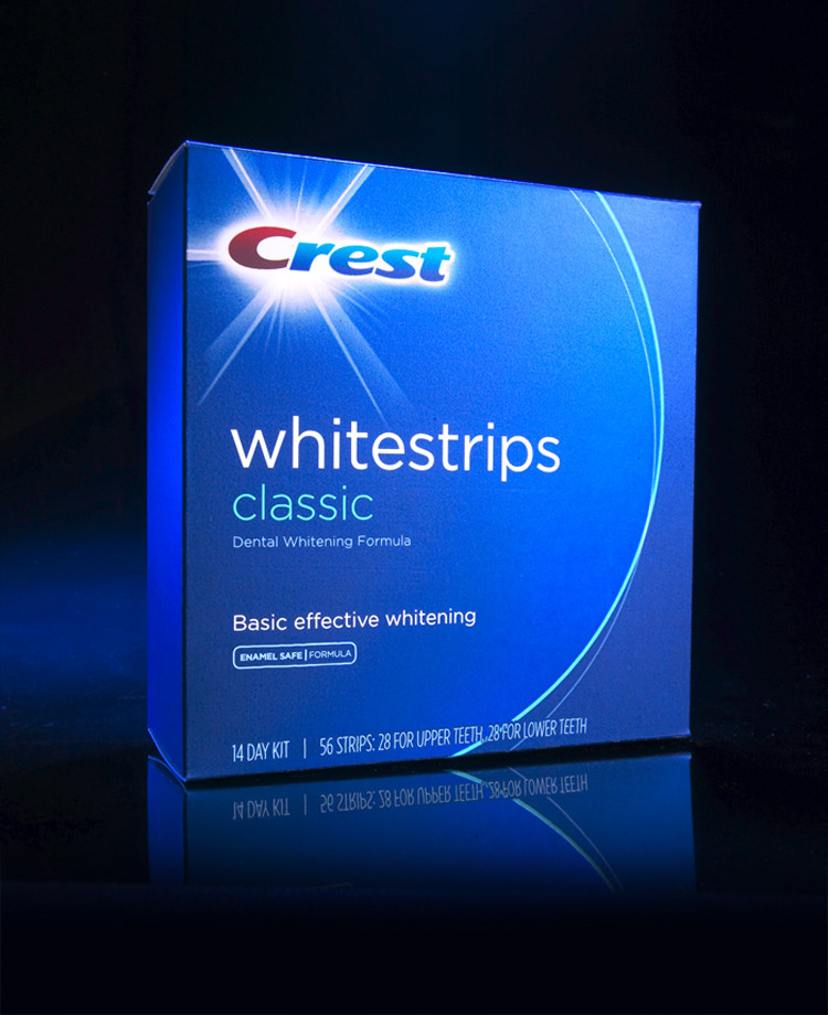 “Classic”
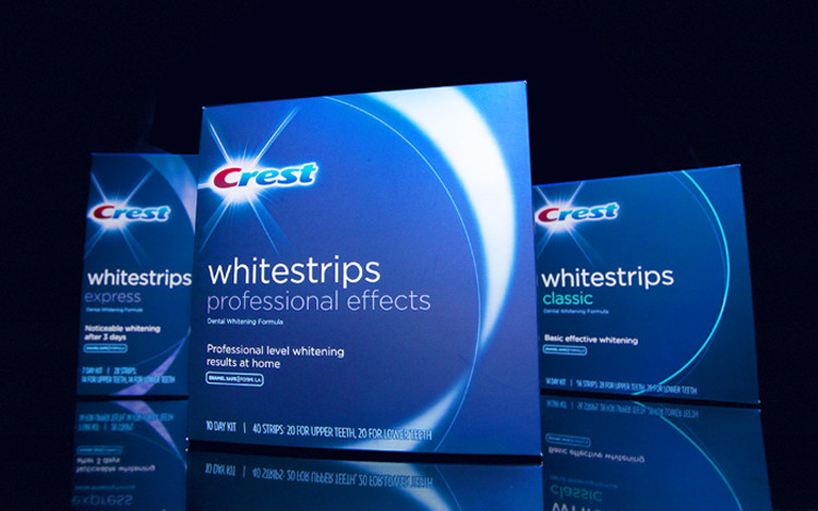 Family