Staples, Inc. 2016 Back-to-school package and signage design
Background
Staples has always viewed their busiest, most profitable time period to be the back-to-school season. Promoting back-to-school is critical to its success and a key part of that is the look, feel and voice of the campaign. Every year it’s new. However, the campaigns have never really distinguished themselves visually from their competitors, such as Office Max, Target, etc. For 2016, they wanted something not only new, but unique and fresh.
Solution
The new campaign design is a significant departure from anything Staples had ever done before. At it’s core are word bubbles that hold both brand and supportive copy. A variety of “hand-drawn” typefaces add to the playfulness and spontaneous feeling of the design. Whimsical copy is utilized to support the overall theme. All are placed over a blue background collage of “kids’ doodles”.
Fall sales far exceeded expectations, making this one of Staples most successful back-to-school campaigns ever.
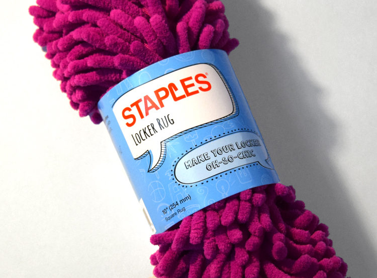 Locker Rug
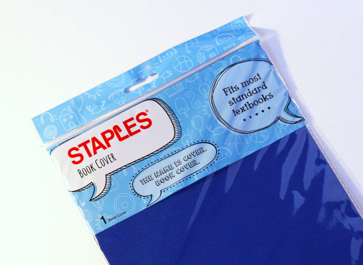 Book Cover
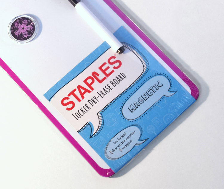 Dry-Erase Board
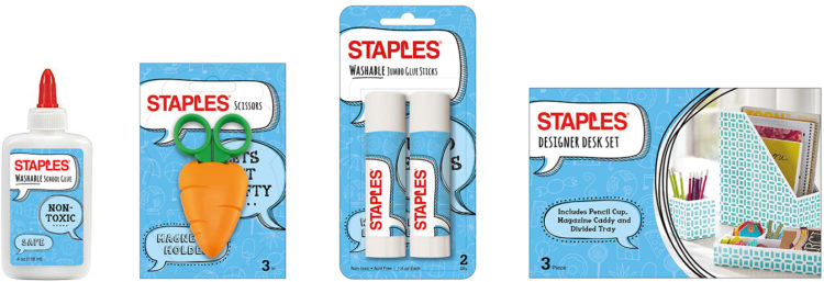 Packaging System
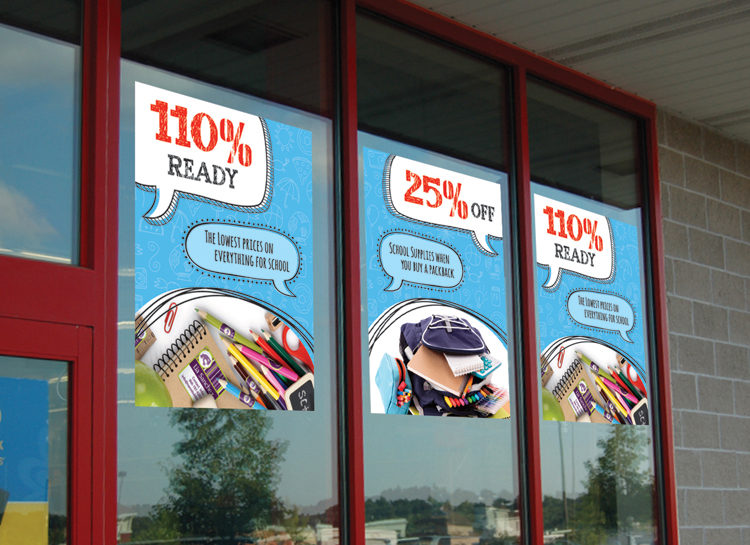 Store Front Signage
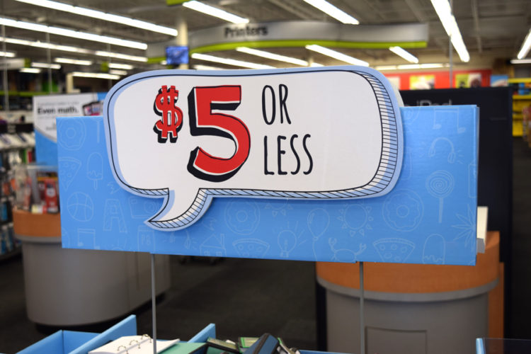 Store Sign
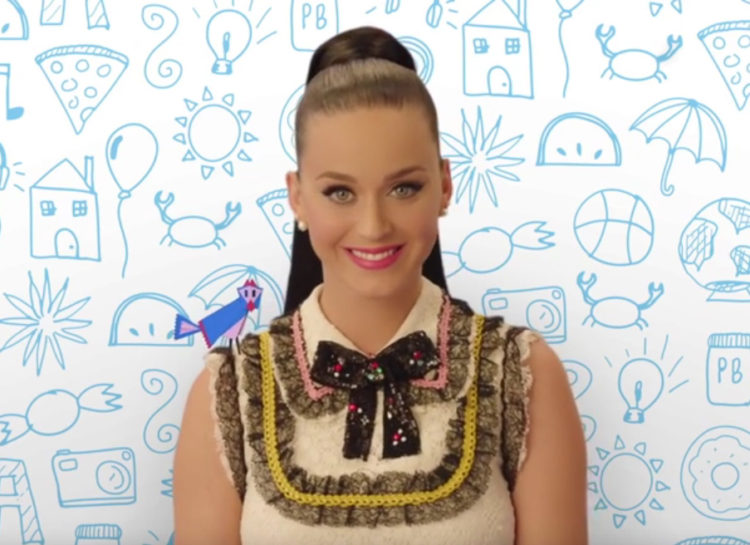 Katy Perry Promotion