Staples, Inc. Avant pen packaging and advertising design
Background
Staples had developed a new family of high-quality writing instruments that would be marketed as it’s own brand and would compete against the most respected national brands. The packaging for this new family of pens, Avant, needed to convey a fresh, smart and sophisticated look that not only differentiated from other Staples’ products, but stood out from the competition as well.
Solution
The new design is anchored by a trade dress motif that was created using the Avant symbol. The bright color-coding system enhances differentiation and maximizes shelf impact. The final result is a clean, contemporary look and feel that reinforces the premium offering.
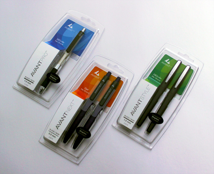 Avant Family
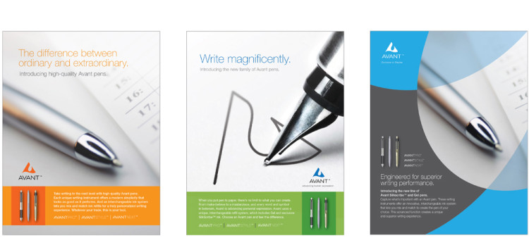 Ad Concepts