Takeda Pharmaceuticals Visual brand language and guidelines
Background
Takeda Pharmaceuticals was established in Japan in 1781 and is the country’s largest pharmaceutical company. Recently they established a U.S. presence by opening
an office outside of Chicago. Brand guidelines had never been developed for the U.S. market. The Marketing Director at TPNA had resorted to using their Japanese corporate guidelines which were both limiting and lacking focus. TPNA needed guidelines that were not only relevant to their market, but inspired those who used it.
Solution
Takeda has always prided itself on maintaining the highest standards of integrity and ethics to serve peoples’ best interests. To help define what the TPNA brand stood for, we developed a “House Style” that established a look, tone and feel for the guidelines and all corporate communication.
Agency: Landor Associates Additional Design Credit: Peter McClelland
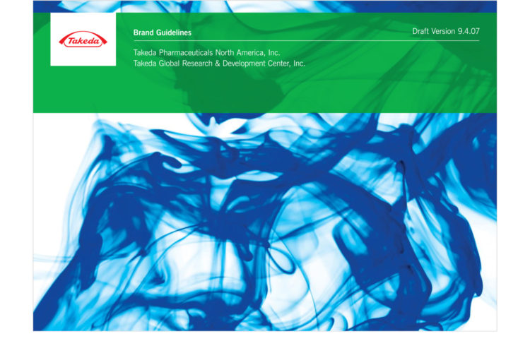 Takeda Brand Guidelines Cover
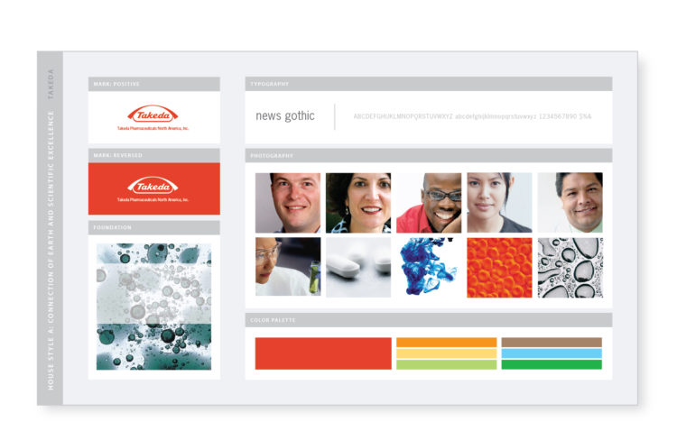 “House Style” System
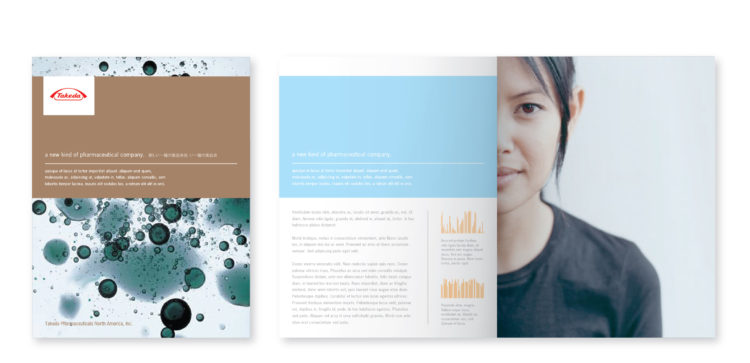 Brochure Cover | Two-Page Spread
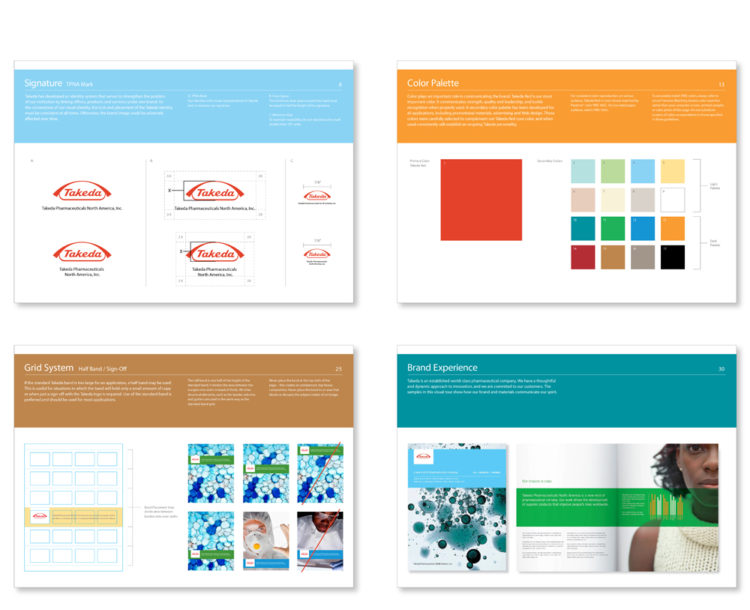 Brand Guidelines
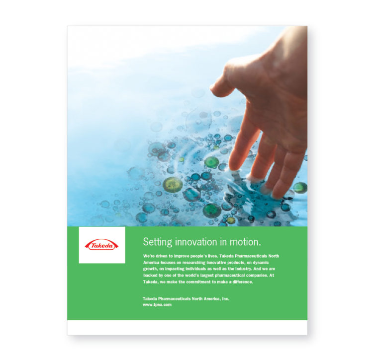 Print Ad